Example synthetic web performance monitoring dashboards using SpeedCurve
Government Digital Service (GDS) have been rolling out synthetic web performance monitoring across all GOV.UK applications (all 13 of them), and the other services run by by GDS. Using SpeedCurve we can now set a whole bunch of performance budgets and alerts that let us know via email and Slack, when a particular threshold has been crossed in the metrics we are monitoring. In rolling this out to all teams, I found myself creating dashboards with a consistent set of graphs. The reason for this method was to:
- try and extract as much useful information from the synthetic tests as possible
- 'standardise' the graphs across teams so I could document and talk about what each meant easily
- compare and contrast performance between each of the applications / services
During this process I created a document for all teams to read with an explanation of the graphs and metrics involved. Instead of keeping it locked away in a Google Document, I've decided to adapt it into a blog post. By doing so I'm hoping it will:
- help others understand the power of the dashboard and graphs you can create using SpeedCurve
- help others by giving example dashboards and graphs they can copy and adapt
- validate my thoughts and understanding of the graphs and metrics with other people in the web performance community
- gather feedback from others to find out if there's anything I'm missing
Browser & devices we are testing on
Synthetic web performance testing gives you fine grain control of the conditions for which the tests are run. Certain browsers and settings have been selected to test against, primarily based off our Google Analytics (GA) data.
Browsers I've currently selected to test with are:
- Chrome Desktop (Cable connection)
- Internet Explorer 11 (Cable connection)
- Firefox (Cable connection)
- Samsung Galaxy S4 (3G connection)
- iPhone 5 (2G connection)
Chrome
Chrome is the 2nd most popular browser used on GOV.UK (after Safari on iOS). It makes up ~30% of our users browser usage. Users tend to use both the desktop and mobile version. It is an obvious choice for inclusion in testing.
Internet Explorer 11
This is the last Internet Explorer (IE) version we officially support according to the Service Manual. Looking at the last 3 months GA data from GOV.UK, I can see it makes up 99.2% of IE usage. Again, an obvious choice for inclusion in testing.
Firefox
Firefox is currently only used by 1.48% of GOV.UK users over the past 3 months (me included). This does make it a candidate for not being included. I'm personally keeping it in as it is the only non-WebKit based browser on our list, and it is always good to diversify testing, as browser engines differ.
Samsung Galaxy S4
Simulated specifications for this mobile are:
- Connection: Mobile 3G
- Viewport: 360x640
- CPU: 3 x slowdown
Many of the tests that I chose to run are using this simulated Samsung S4 mobile phone. The results returned are set at the 95th percentile (p95). The reasons for this are:
- The S4 is a low specification 'legacy' device, with limited CPU and RAM.
- It is a device that is currently used by many users of GOV.UK (~45,000 users in the past 3 months, or 0.04%)
- A 3G connection is fairly standard and expected in the UK for many users.
- The 95th percentile gives essentially the worst case scenario (i.e. 95% of users are going to have a better experience than this). By setting the bar so low, any performance improvements we can make at this level will likely improve performance for every device setup.
2G Mobile (effective iPhone 5/SE)
This is a custom browser profile that I have created in the SpeedCurve settings. Specifications for this simulated mobile are:
- Browser: Chrome
- Dimensions: 320x568
- Pixel ratio: 2
- Connection: Mobile 2G
- CPU: 4 x slowdown
- User Agent: Mozilla/5.0 (iPhone; CPU iPhone OS 9_1 like Mac OS X) AppleWebKit/601.1.46 (KHTML, like Gecko) Version/9.0 Mobile/13B137 Safari/601.1
This phone is currently used by ~87,000 GOV.UK users over the past 3 months (or 0.08%).
Example dashboard 1 - A GOV.UK application
Now that we understand the test devices, let's look at the whole 'standard' dashboard used for each GOV.UK application:
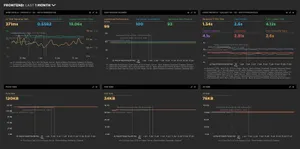
Each application runs a particular set of pages on GOV.UK, so it's good to get a general overview of how well the application is delivering pages to a user. So let's delve into what each graph is telling us.
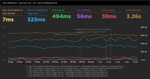
Web Vitals - iPhone 5 - 2G - 95th Percentile
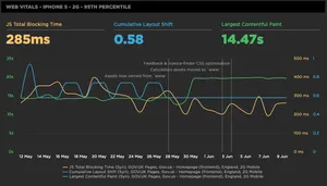
Web Vitals is a marketing name for a set of metrics that are soon to become very important in the Search Engine Optimisation (SEO) world. Google published a blog post recently stating that in 2021 its search ranking algorithm will start to use the scores from these metrics to influence a page's rank. The metrics they have chosen to use are user-centric and ensure that a page must:
- Load quickly (Largest Contentful Paint)
- Be interactive within a reasonable time (JS Total Blocking Time for Synthetic testing, First Input delay for RUM)
- minimise jarring interstitials that affect visual stability (Cumulative Layout Shift)
These metrics have been chosen so as to help start ranking pages based on their overall usability for a user. Pages that score poorly in these areas will be penalised.
Note: An iPhone 5 on a 2G connection has been used in this instance, as when using the Samsung Galaxy S4 device, it doesn't seem to support Cumulative Layout Shift. So this selection gives an idea of the result of these metrics on a low-specification device, on a very slow connection.
JS Total Blocking Time (TBT)
According to the Core Web Vitals, First Input Delay (FID) is the metric that should be used for indicating if a page is interactive for a user. Unfortunately, this metric is only available via Real User Monitoring (RUM) testing, and not available in synthetic testing. An alternative synthetic metric is available to measure page interactivity. It is called Total Blocking Time.
Total Blocking Time measures some of the activity on the browsers main JavaScript thread. Too much activity on the main thread can cause a page to not respond to user input, causing confusion and frustration for users. Any script that takes over 50ms to execute is known as a 'long task'.
So the 'total' in TBT is a little misleading. It in fact doesn't measure the total as you would expect (initial navigation to fully interactive): In reality TBT:
- only tracks the long tasks between First Contentful Paint (FCP) and Time to Interactive (TTI)
- only tracks time over the initial 50ms (the threshold for a 'long task')
TBT is the sum of the scripts after these two criteria has been applied. So TBT is great for understanding your Lighthouse score, but there are other ways to track scripts with long tasks on your page. There's a whole post here from Mark Zeman which talks all about it if you want to know more.
Cumulative Layout Shift (CLS)
Cumulative Layout Shift measures the visual stability of a page. The visual stability of a page is affected by late displaying elements, causing the whole page to 'shift'. This is especially problematic on mobile devices, and sometimes causes users to click on buttons and adverts they didn't intend to.
A brief explanation as to how it works: when rendered elements move during page load, they are labeled as 'unstable'. A score is calculated by taking the distance that the unstable elements have moved in the viewport (this is the distance fraction), and multiplying it by the surface area of the viewport that's affected by unstable elements moving (this is the impact fraction).
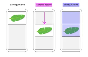
The cumulative layout shift score is the sum of the above calculations for all unstable elements on a page that move around during the page load. Diagram credit goes to the Calibre app team.
Largest Contentful Paint (LCP)
This metric measures the loading performance of a page. It does this by reporting on the render time of the largest content element visible within the viewport. A LCP of 2.5 seconds or less is considered good, 2.5 - 4 seconds needs improvement, 4+ seconds equates to a poor user experience.
Lighthouse Scores
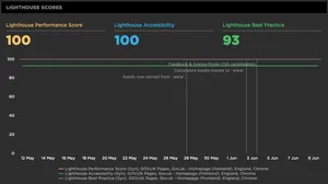
Google Lighthouse is a tool built into every version of Chrome DevTools. It is a set of best practice audits that can be run against any website via the DevTools 'Audit' tab. The results give you a score out of 100 for the following areas:
- Performance
- Accessibility
- Best Practice
- SEO (omitted from our tests)
- Progressive Web App (omitted from our tests)
We aren't tracking SEO and PWA scores since they are a lower priority for our services.
Lighthouse Performance Score
The lighthouse performance score gives you an idea of how well your service is performing. Scoring is based on a range of metrics that are weighted according to priority. The focus of this audit is on user-centric metrics, so it optimises for performance a user will actually care about and respond too. Performance scoring details can be found here for both v5 and v6 of Lighthouse.
Lighthouse Accessibility
The accessibility score gives developers a way to identify accessibility issues on a particular page. These issues are often 'low-hanging fruit', that may be relatively simple to fix. A full list of the accessibility checks the tool runs can be found here.
Note: It's important to realise that an accessibility score of 100 doesn't mean a service is 100% accessible. It just means it has passed those specific tests. A service should still be professionally audited and tested with users.
Lighthouse Best Practice
The best practice score looks for issues related to infrastructure and coding best practices in the page source. It is marked on a number of separate criteria. A full list of the criteria it examines and the relative weights applied can be found here.
Core Metrics - Galaxy S4 - 3G - 95th Percentile
This graph is used to track a ‘core' set of web performance metrics that are considered to be very important in how a user experiences a website. Not all the metrics are 'user-centric', but they do give you a good sense of how well a page is performing and where bottlenecks are likely to be located.
Backend (TTFB) Time
Backend time (also known as time to first byte), is the time it takes for a request packet to leave the browser, for the server to process the request and a response to come back to the client. DNS lookup, connection, and TLS negotiation time are also included in this time. In many cases this should be one of your more stable metrics. Things like database lookups, routing, and template compilation can have an effect on this metric. There's a whole blog post here by Harry Roberts if you'd like to find out more about it.
Start Render
Start Render is the time between the initial page navigation and when the first pixel content is rendered to the display. This metric is very good for understanding the point at which a user sees anything on screen. It is calculated by analising of the page loading, so is only available in synthetic testing.
Fully Loaded Time
Fully loaded is defined as the time from the start of page navigation, up to the point where no network activity has occurred for a total of 2 seconds after document complete (onload event fired). This metric is useful for understanding the amount of data being downloaded after the onload event has fired (e.g. via a Single Page App, or third-party JavaScript on a page).
Visually Complete
The visually complete metric focuses on the viewport that the page is being rendered on. It is calculated by analysing a video of the page load, then comparing each frame to the pages final state at the end of the test. This essentially plots page 'completeness' over time. It will give you an indication of how quickly pixels are being shown to the user, and at what point the viewport reaches 100% rendered. Note: there may be other areas of the page still loading outside of the viewport (‘below the fold').
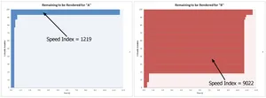
Speed Index
Speed index takes the visual progress of the visible page load (in the viewport), and calculates an overall score to help understand how quickly content was painted to the viewport. This score is calculated using the same method as mentioned above in Visually complete. The 'completeness' of the page is plotted over time by doing a frame-by-frame analysis of each frame against the final frame. By plotting the completeness over time and calculating the (bounded) area above the graph, it gives information as to what portion of the page is left to be rendered at any point in time. A lower Speed Index score is better.
Asset sizes
The last three graphs are fairly self-explanatory. They give an indication of how the size of each type of static asset on the page has changed over time. It is a good idea to monitor these metrics across releases to see what difference new changes have made to the download size. The aim is to minimise the size of all these assets to improve frontend performance.
Example dashboard 2 - An important GOV.UK page
Here we've setup a slightly different dashboard to get more information back from the test device to see if there are any CPU bottlenecks on the page (and how much CPU time is being used):
Web Vitals - iPhone 5 - 2G - 95th Percentile
Same as listed above.
Milestone Timings - Samsung S4 - 3G - 95th Percentile
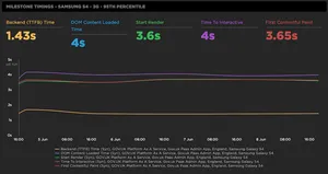
The graph shows important milestone metrics in the lifecycle of a page load. The aim is to reduce these metrics as much as possible to help improve user experience. It's worth noting that many of these aren't considered to be user-centric metrics, but they are worth monitoring to give you a more complete picture of a pages performance.
Backend (TTFB) time
See above under core metrics.
DOM Content Loaded time (DCL)
DOM Content Loaded Time is the point at which the DOMContentLoaded event fires. This is indicates when the Document Object Model (DOM) has been loaded and parsed. The event does not wait for other assets like stylesheets and images to load before firing. This metric is often used by JavaScript libraries to identify when they can start manipulating the DOM.
Start Render
See above under core metrics.
Time To Interactive (TTI)
Time to interactive is a complex metric, as it doesn't measure what most people think it measures which is the time it takes for a page to become interactive. This is very hard to actually measure via synthetic performance testing. What this metric should be called is Time to consistently interactive, as the page will likely be semi-interactive before this point. The metric indicates the time at which a site is visually rendered and consistently interactive for a user. There's a whole blog post here all about it for those who want to know much more.
First Contentful Paint (FCP)
First Contentful Paint measures how long it takes for the browser to render the first piece of DOM content to the page after user navigation. DOM content is defined as either:
- Text and images
- Non-white
<canvas>elements - SVG's
- Note: anything inside an
<iframe>isn't included
FCP is a user-centric metric. It answers a user's question "Is it happening?". 0-2 seconds is considered good, 2-4 seconds is moderate, over 4 seconds in considered to be slow.
CPU Metrics - Galaxy S4 - 3G - 95th Percentile
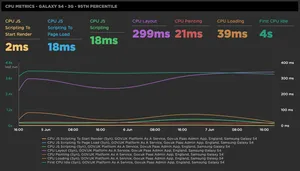
The graph shows important CPU metrics related to the browsers page loading process. Any increase in these metrics means that the browser is having to work harder to paint pixels to the screen. High CPU usage can result in pages that are slow to respond to users, and have a negative impact on a devices battery life. The aim is to minimise all of these metrics.
CPU JS Scripting To Start Render
This is the amount of CPU time the JavaScript used to get to the start render point. Start render time is defined as the time between initial page navigation, to the first pixel being displayed on screen.
CPU JS Scripting To Page Load
This is the amount of CPU time the JavaScript used to get to page load. Page load is when the onload event fires, and is the point where the page and all its dependent assets have finished loading.
CPU JS Scripting
This is the total CPU time used when parsing and executing the JavaScript on the page.
CPU Layout
This is the CPU time taken to layout the page. Layout computes the exact position and size of each object on a page.
CPU Loading
This is the time taken to parse the HTML and the CSS, and create the render tree (DOM + CSSOM).
CPU Painting
This is the CPU time taken to paint pixels to the page. The paint process takes the final render tree and renders the pixels to the screen.
First CPU Idle
This is how long it takes a page to become minimally interactive. It is minimally interactive when most (but not necessarily all) UI elements are interactive, and the page responds to the user in a reasonable amount of time.
Lighthouse Scores
See above under Example dashboard 1.
Core Metrics - Galaxy S4 - 3G - 95th Percentile
See above under Example dashboard 1.
Image Size
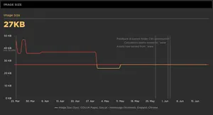
So we are already tracking the asset sizes (CSS, JS, fonts) at an application level as seen in the Example dashboard 1 above. But because we are now focussing on an important individual page, we are also tracking the size of images on this page. This is a great idea if these images are uploaded through a content management system, as a lot of the time they may not be fully optimised.
Conclusion
Hopefully I've given you an idea of what graphs you could add to a dashboard, and what each of the corresponding metrics mean. Synthetic tests give you so much information about a page, so it's important to pick out the metrics that will help you identify and rectify web performance issues. As mentioned at the start of the post, if you have any feedback on the graphs I've chosen, or if I'm missing anything please let me know via Twitter. I'd love to see the graphs & dashboards you are creating in your testing tools to maximise the amount of useful data you are extracting from synthetic tests.
Post changelog:
- 21/06/20: Initial post published.
- 22/06/20: Updated Total Blocking Time explanation as it was incorrect. Thanks Mark Zeman.